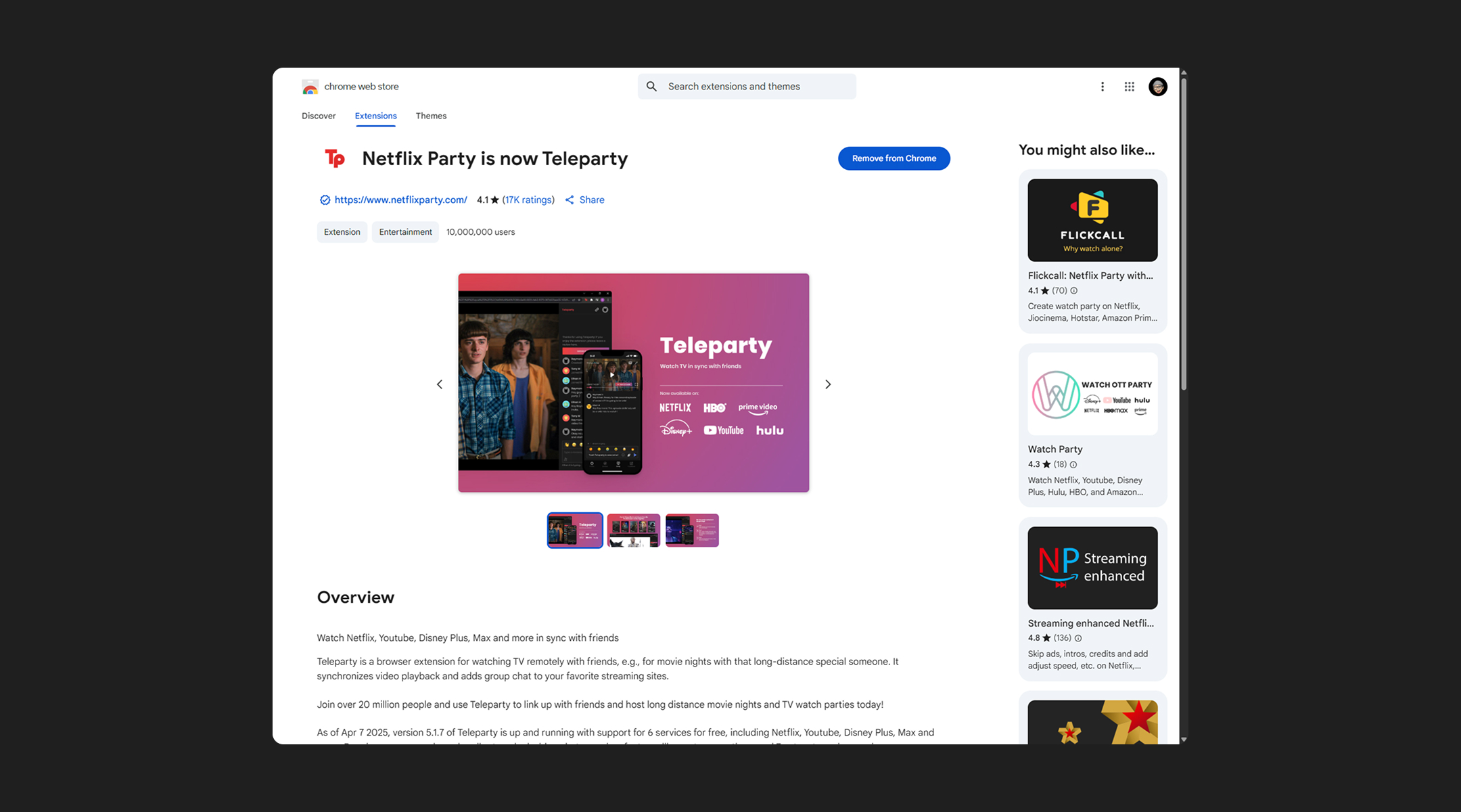
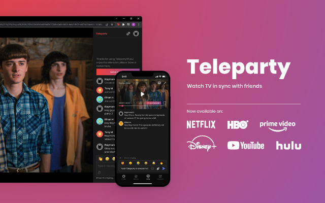
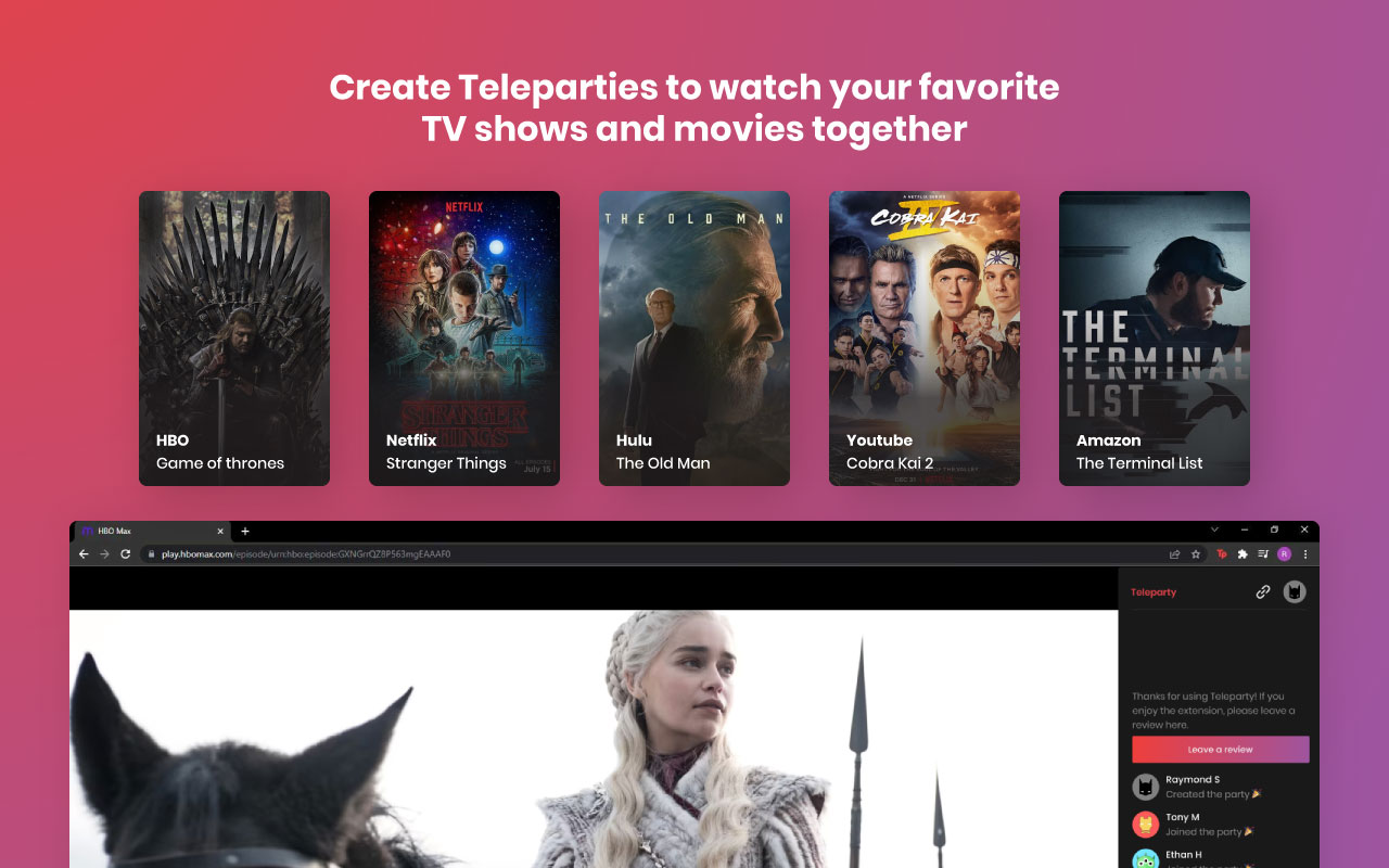
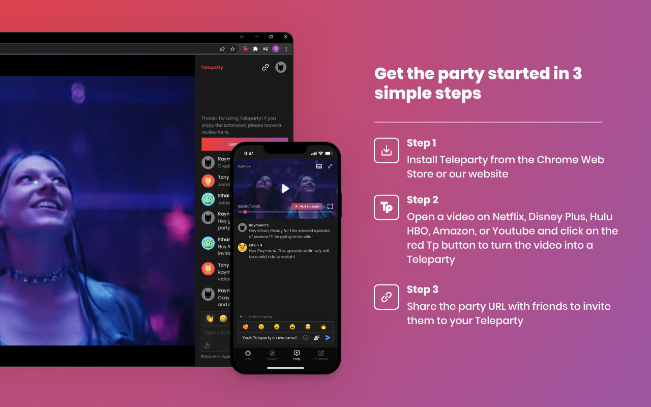
Teleparty lets you watch Netflix, Hulu, HBO, Crunchyroll, and other
streaming services together in sync.
To enhance our product, I conducted research on the market and users,
uncovering opportunities to improve retention, attract new users, and
boost daily engagement.
Branding
Teleparty was built from scratch by the founder and early team. When I joined, there was no design, branding, or system in place, so I was tasked with discovering and defining the brand.
Our first step was a design workshop to explore ideas for Teleparty’s new logo and brand identity, tied to movies and enjoyment. I explored 20 logo concepts, refining them until we selected a final design. The chosen logo underwent rigorous testing across various placements and media—print, digital ads, and marketing—to ensure it works seamlessly everywhere.


After finalizing the logo, I developed a color palette to communicate Teleparty’s identity and services. We chose black, red, and purple to evoke the theater experience while giving the product a premium, high-quality streaming look.


To complement the new logo and aesthetics, we tested several fonts and settled on Poppins for its structural similarity. Poppins also aligns with the brand’s identity and core values, conveying a fun and modern feel.

To further strengthen the brand identity, I designed custom icons to ensure visual consistency across all products. Using rounded corners, the icons evoke a fun, modern, and premium feel that ties back to the product’s core values.
Extension
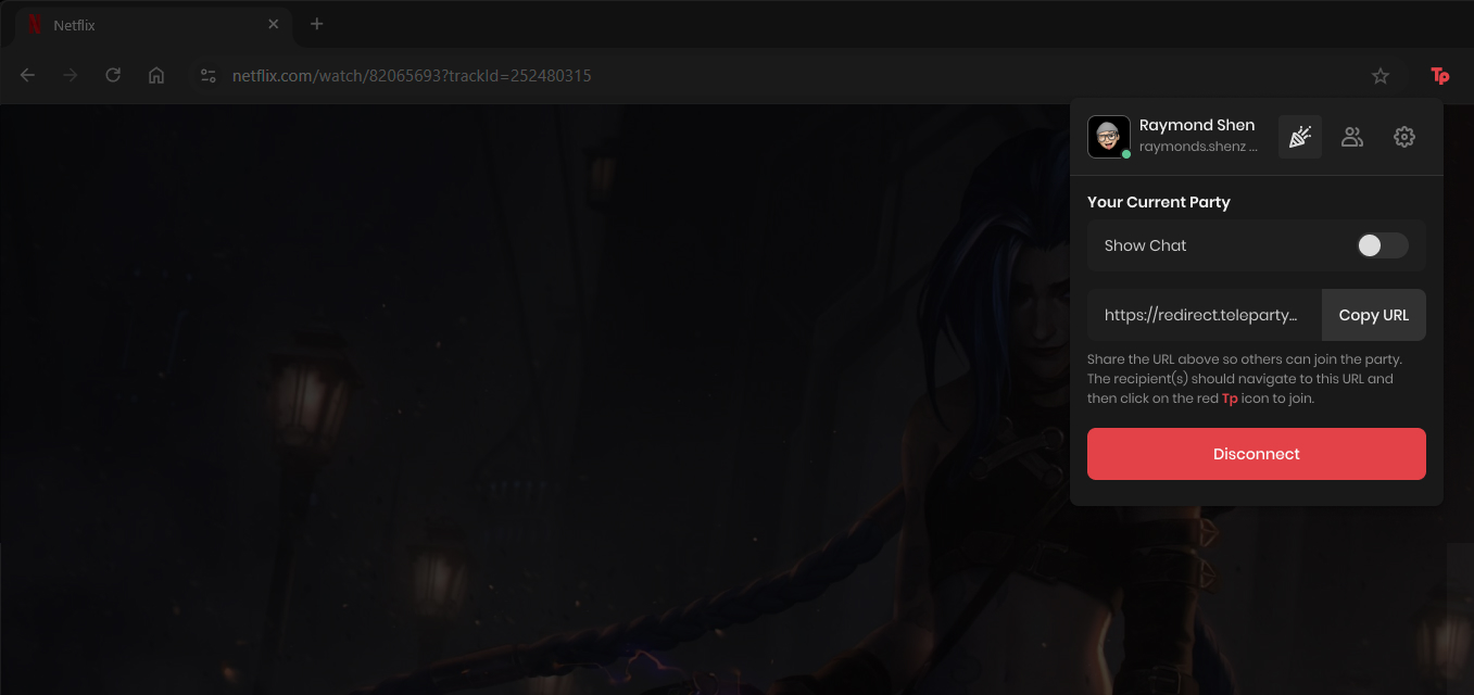
The extension was one of the first products launched when I joined Teleparty. The redesign focused on improving the interface and streamlining the experience to reduce friction for hosts starting a party.
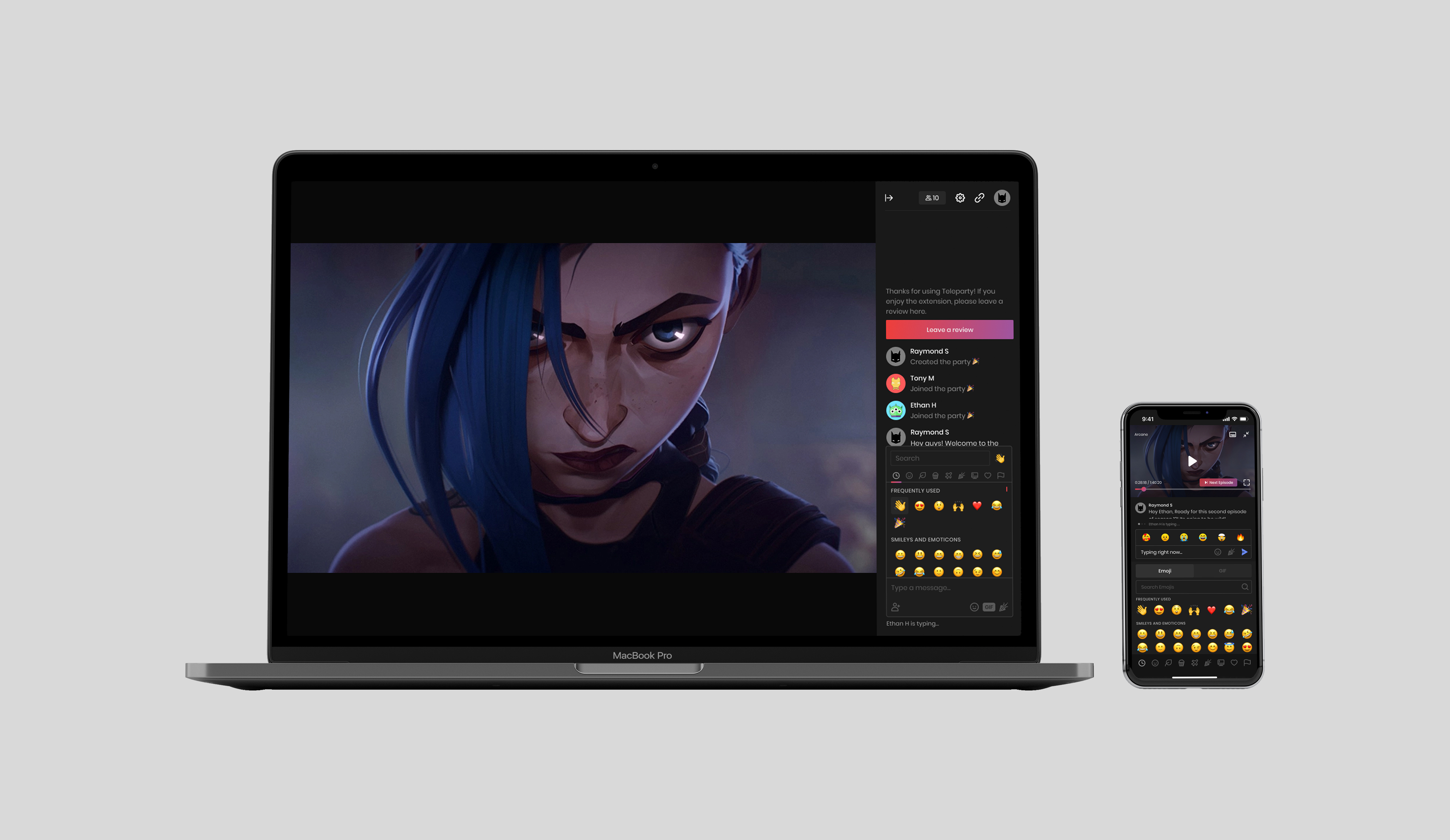
Redesigned the chatroom with added functionality—GIFs, emojis, and reactions—guided by rebranding efforts and user feedback.
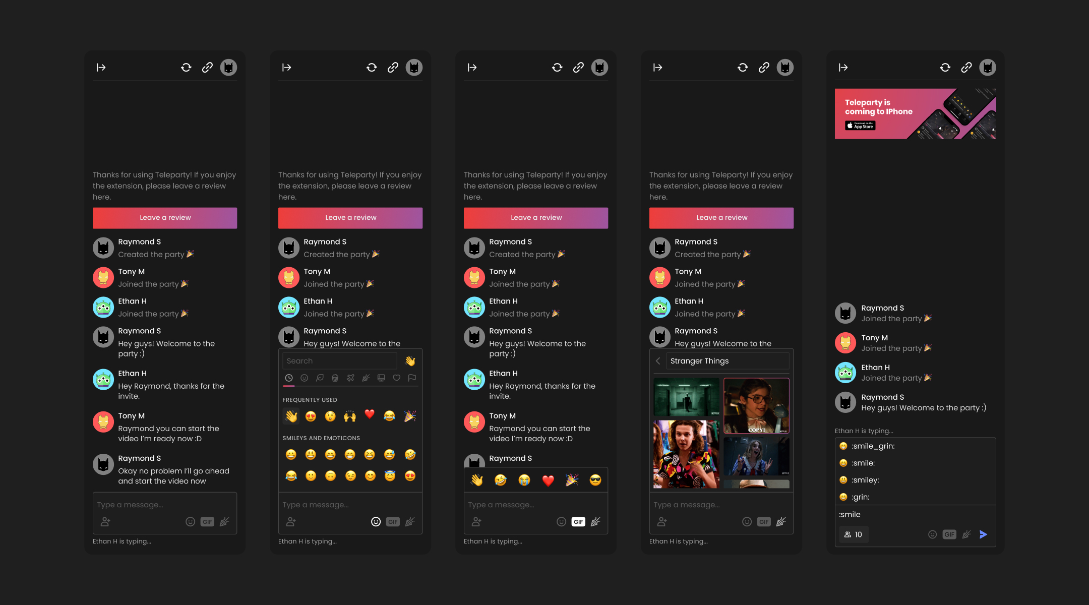
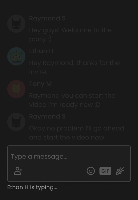
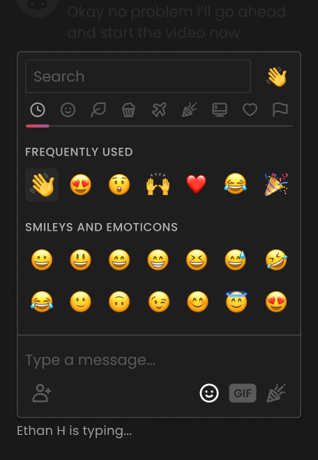
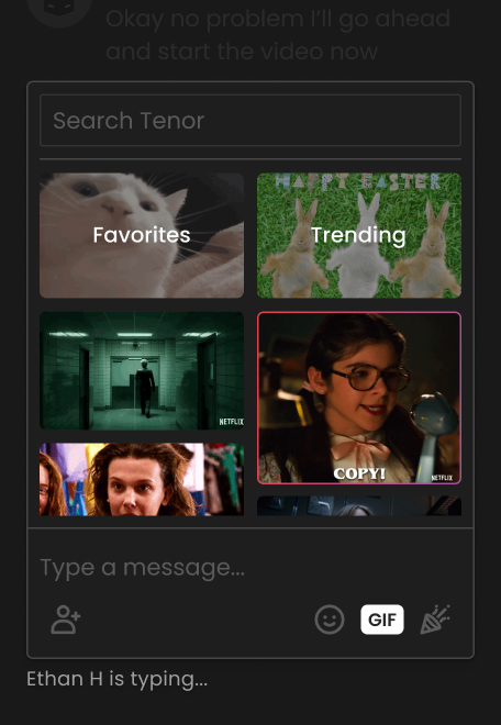
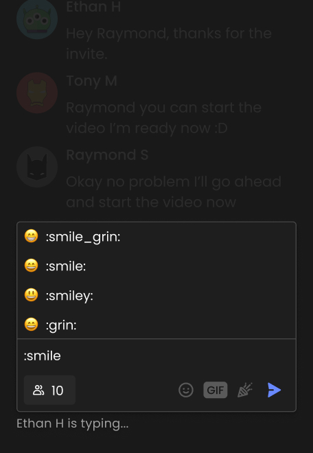
The party creation flow redesign reduced steps, established clear hierarchy, and reinforced brand consistency to enhance the overall user experience.


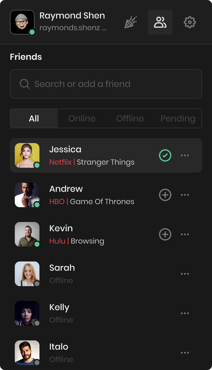
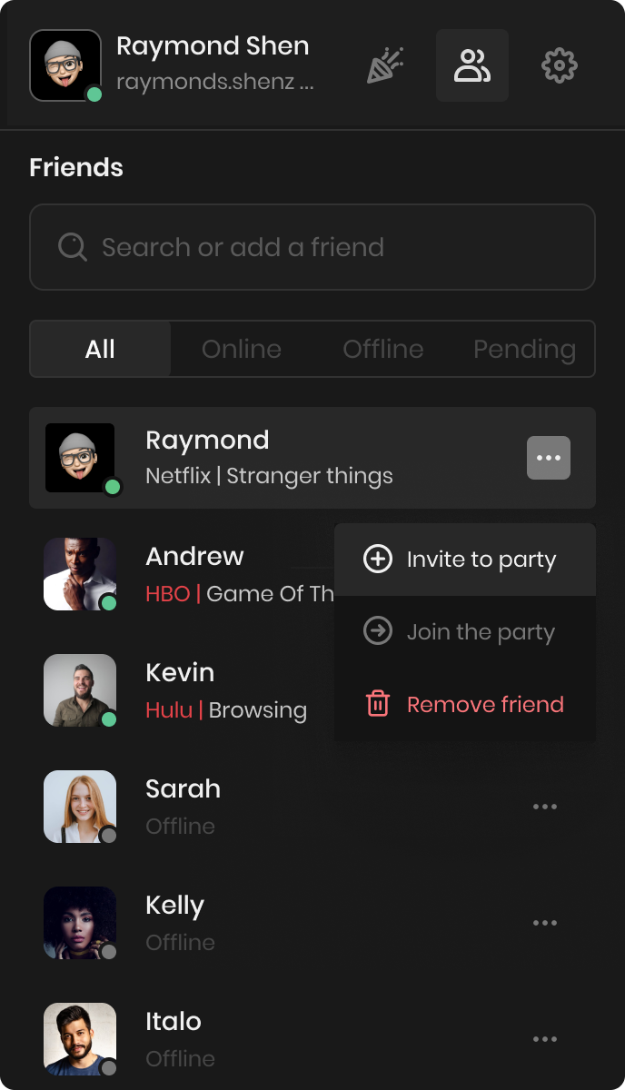
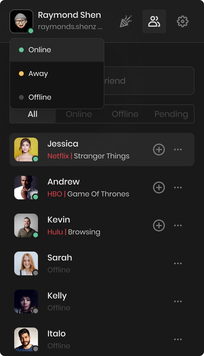
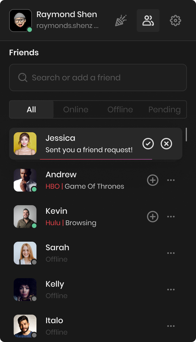
While at Teleparty, we planned a friend list system to create a social network within the platform. Although it never launched, below are the screens showcasing the concept.
Mobile
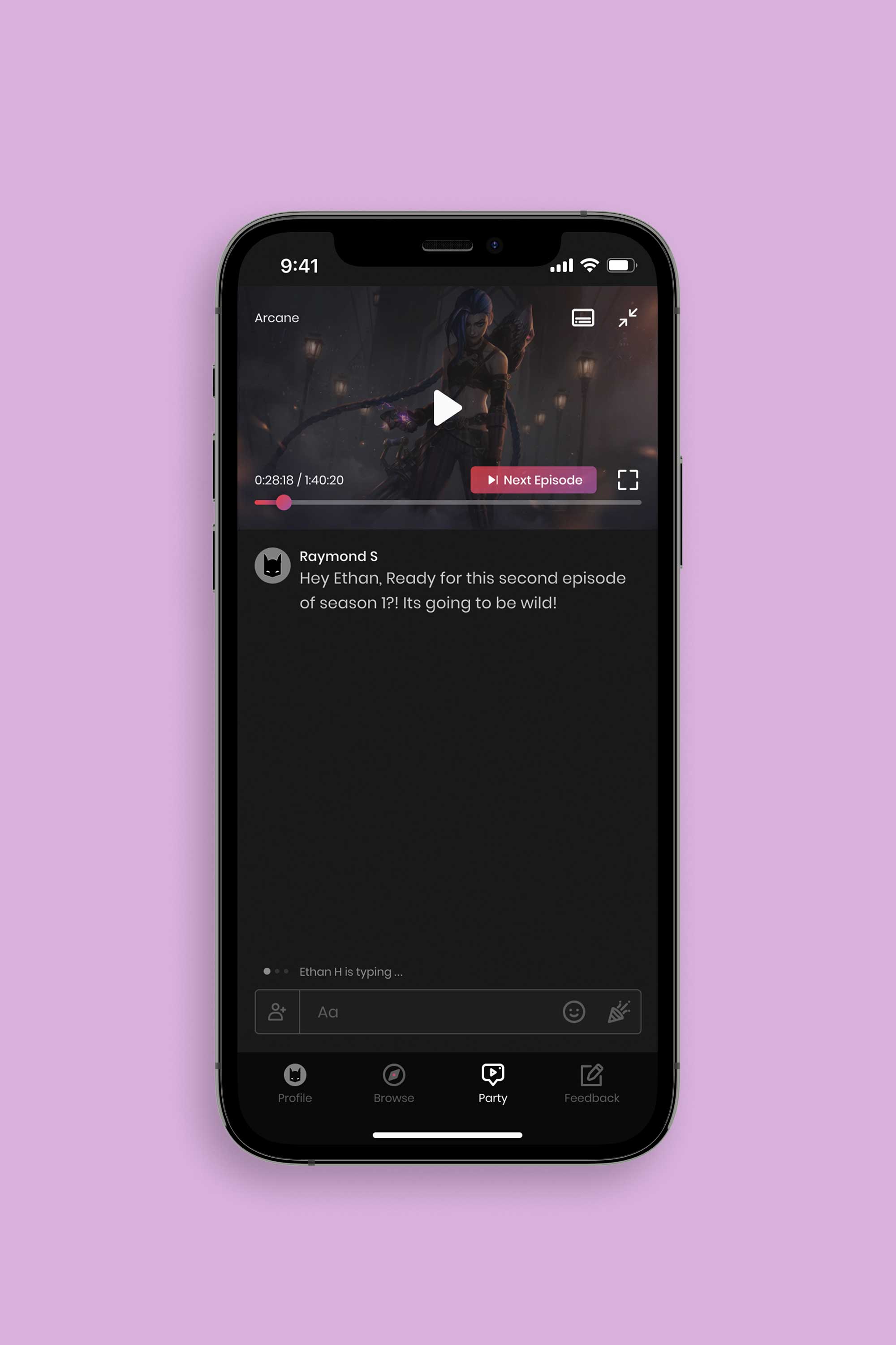
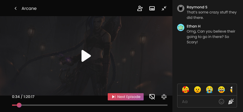
As the company grew over four years, we shifted focus to developing a mobile app for Teleparty, enabling users to watch in sync across desktop and mobile. I led the design, tackling the challenge of adapting interactions from the familiar desktop extension to mobile.
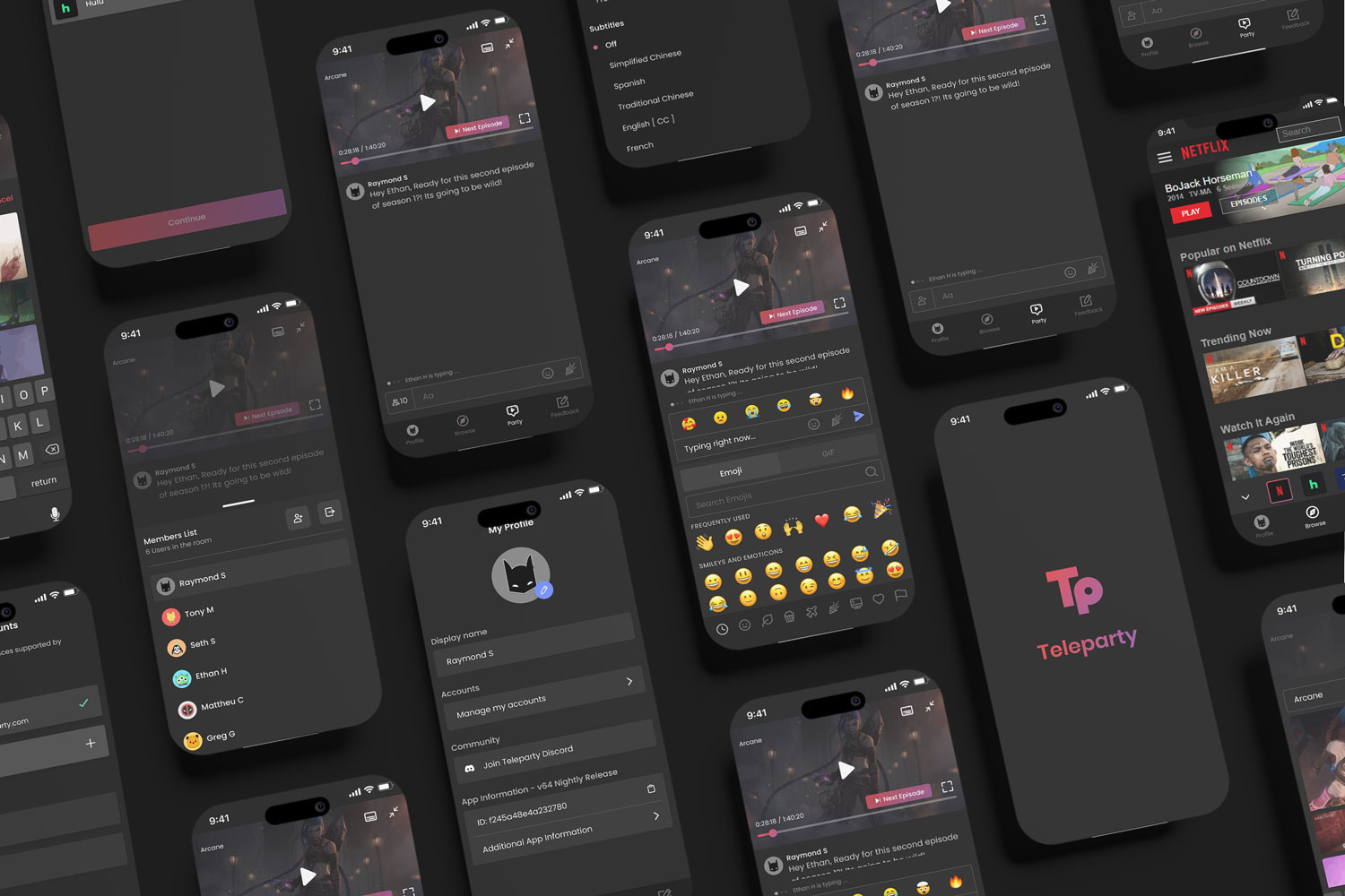
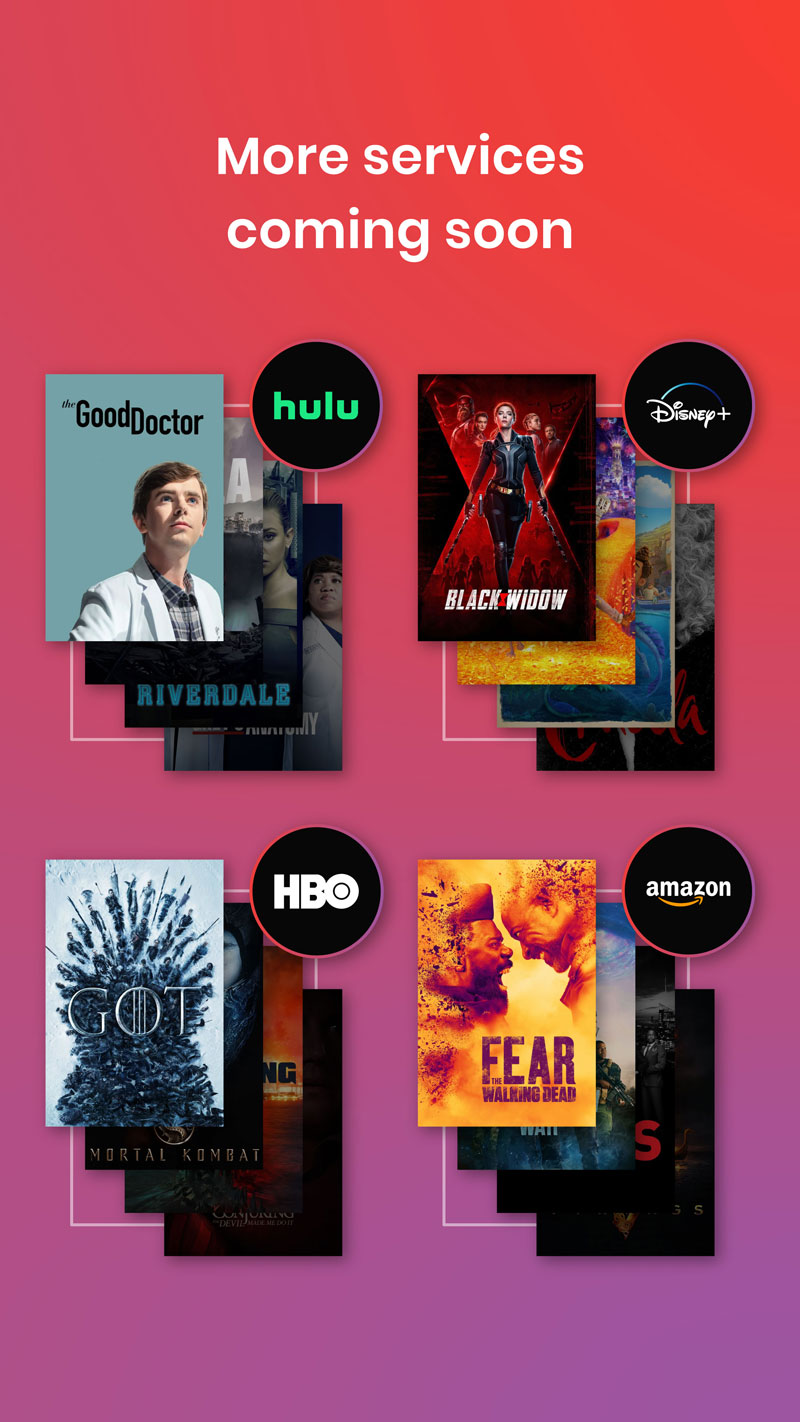
The first challenge was enabling users to switch between streaming platforms as they could on desktop. Below is the flow showing how a user logs into their subscribed platforms and switches between them.
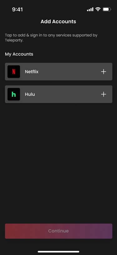
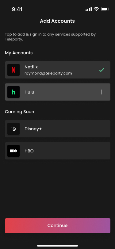
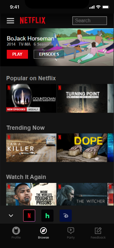
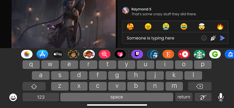
After collaborating with developers to refine the UI for streaming service integration, we focused on chat input functionality—how hosts invite users, interactions with GIFs, emojis, and reactions—and branding the media play bar and icons.
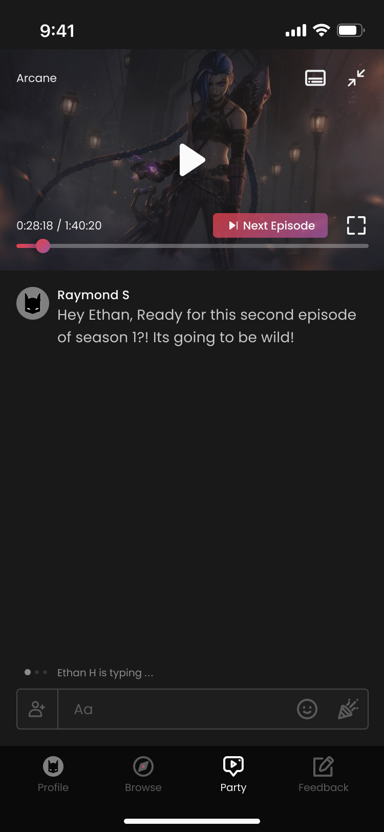
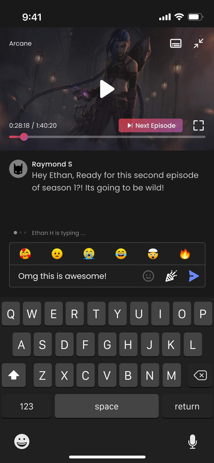
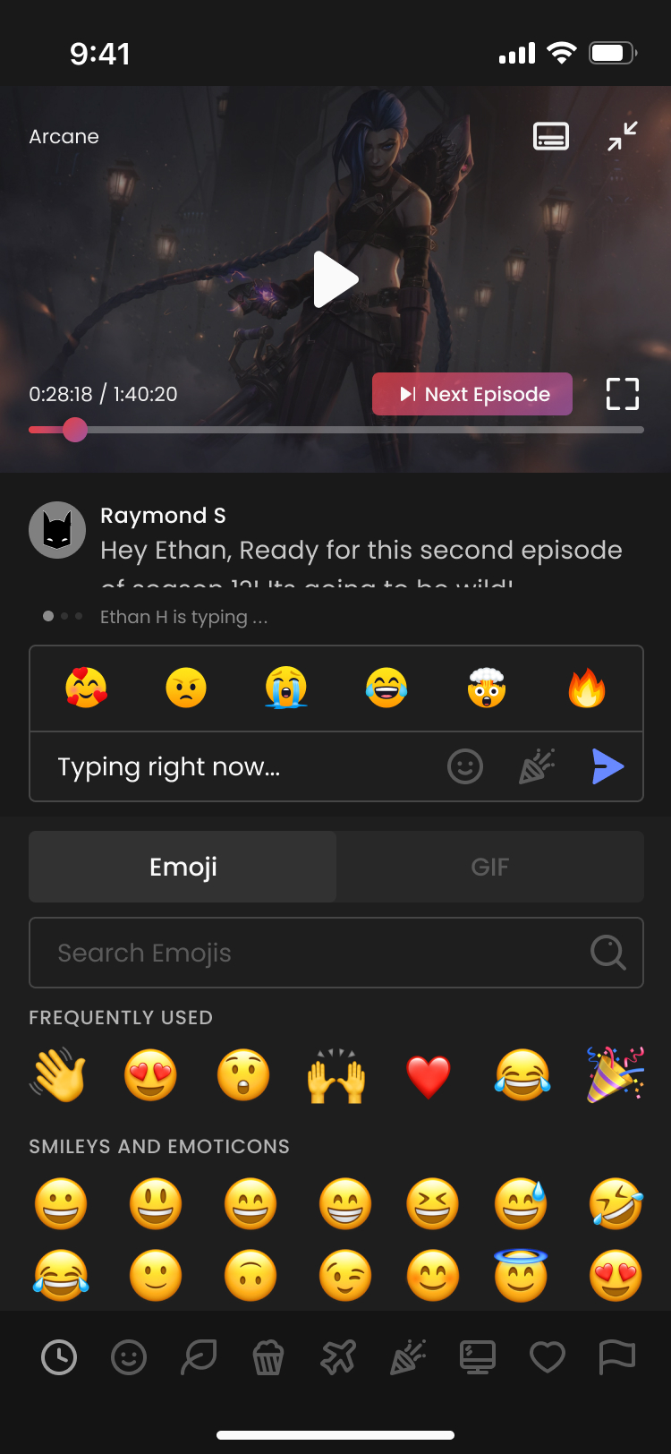
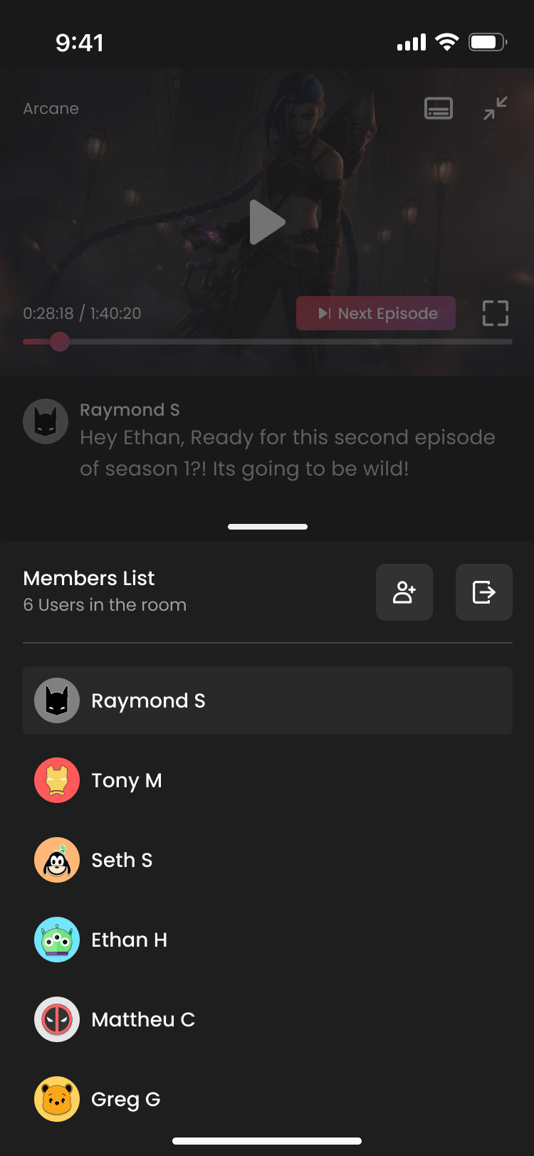
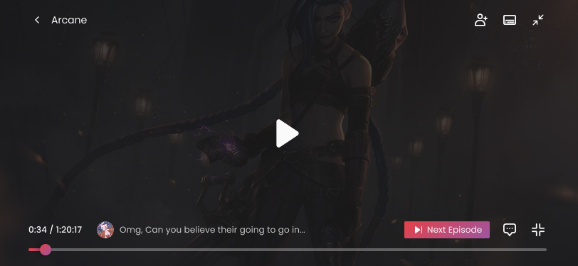
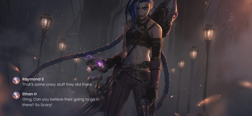
Lastly, I worked on designing how the chat view would appear when users stream in horizontal mode.
Website
Teleparty’s website design focused on the landing page to advertise and describe the service. I also designed the support page to provide detailed information and resolve common user questions.
Below are video assets I created for Teleparty’s homepage to showcase its features and how to use the platform.
Store Screenshots
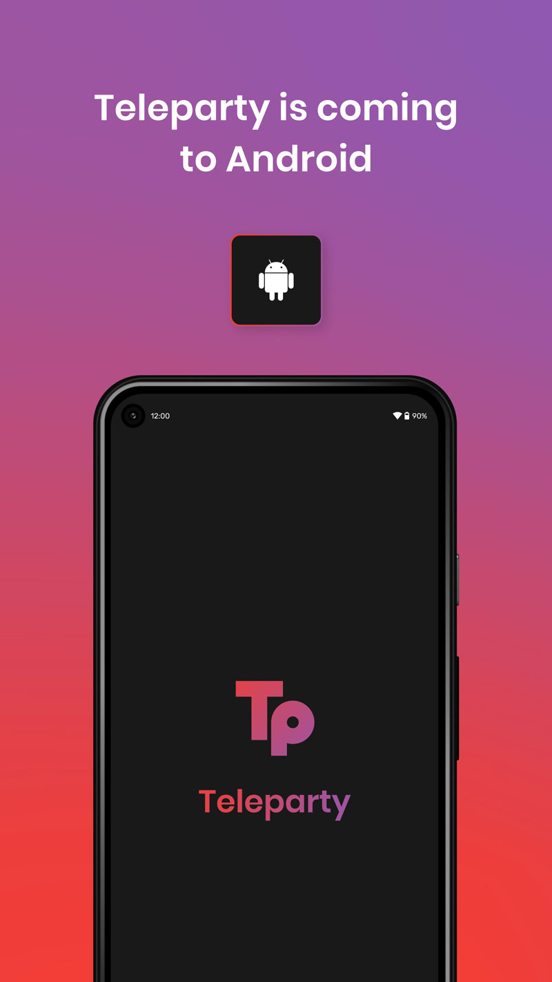
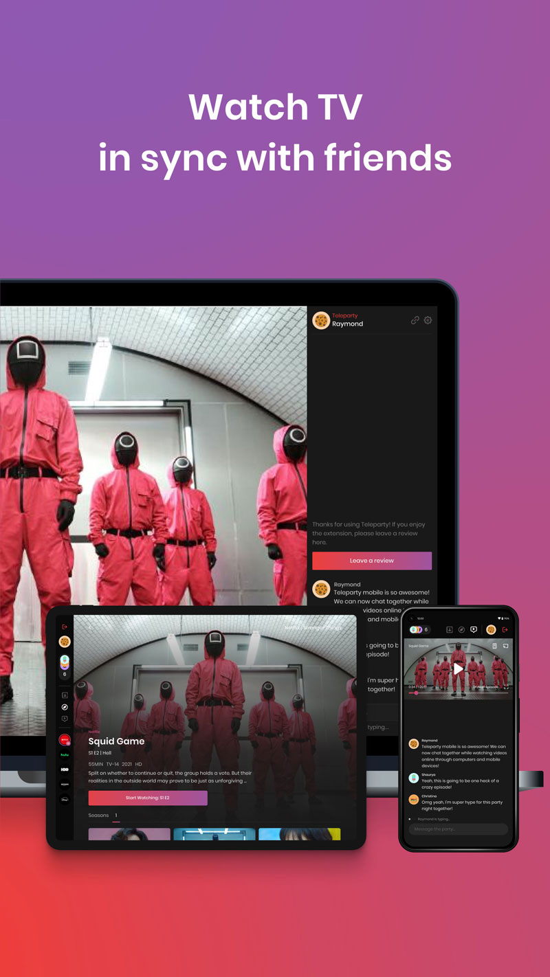
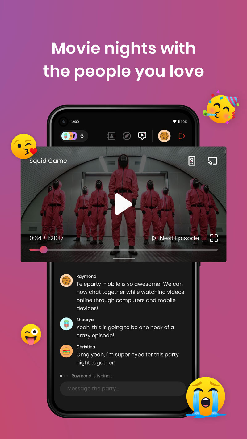
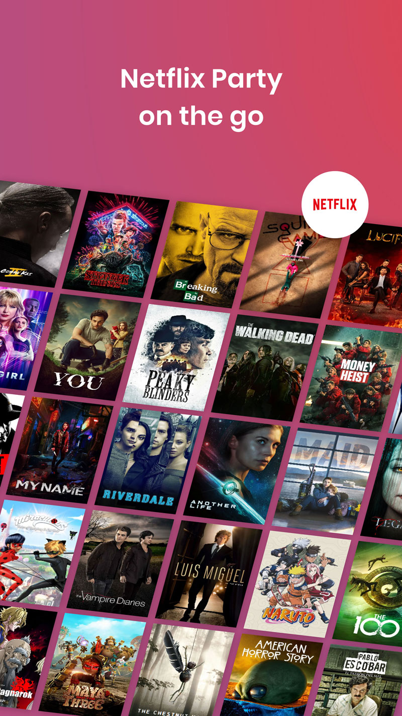
Graphic assets were updated after the rebrand to align with new features and better reflect the app’s functionality.
Check out Teleparty's Android App here.
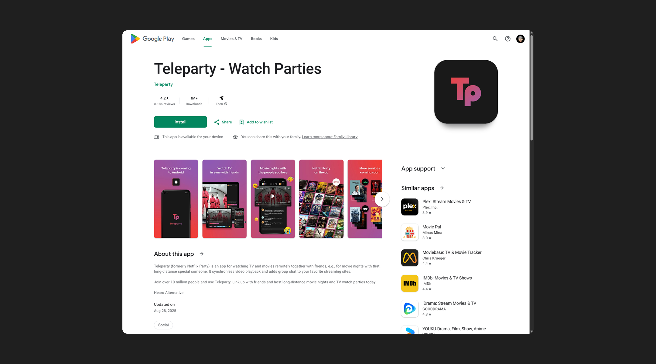
Check out Teleparty's Chrome Extension here.
